Area One - The Logo
The Original

Here is the original Launchr logo that I was given to revise. The original logo had three main areas of concern that I focused in on while reworking it: scalability, color, and type. The original logo was incredibly hard to see as a favicon and did not scale well in any size between. The colors I felt did well at representing both the feel of a launch and the pinks and blues of technology, but felt really stark and did not mesh well together. The type was the final area that I felt needed redesigned. The font (Fieldwork) is actually quite appealing to me so I chose to keep it. However, even though Launchr is a subsidiary of sorts to the marketing firm New North, I felt that the brand needed to shift away from the NewNorth branding and become more of its own entity.
The New Branding

One of the main pieces of the rebrand is the logo. In the new Launchr logo, we can see solutions to all of the issues listed in the previous paragraph. The logomark now appears much more vivid as a favicon, the colors have not only kept their meaning but even intensified them with fluidity in mind, and the type is simplified to keep Launchr fresh and a standalone service.
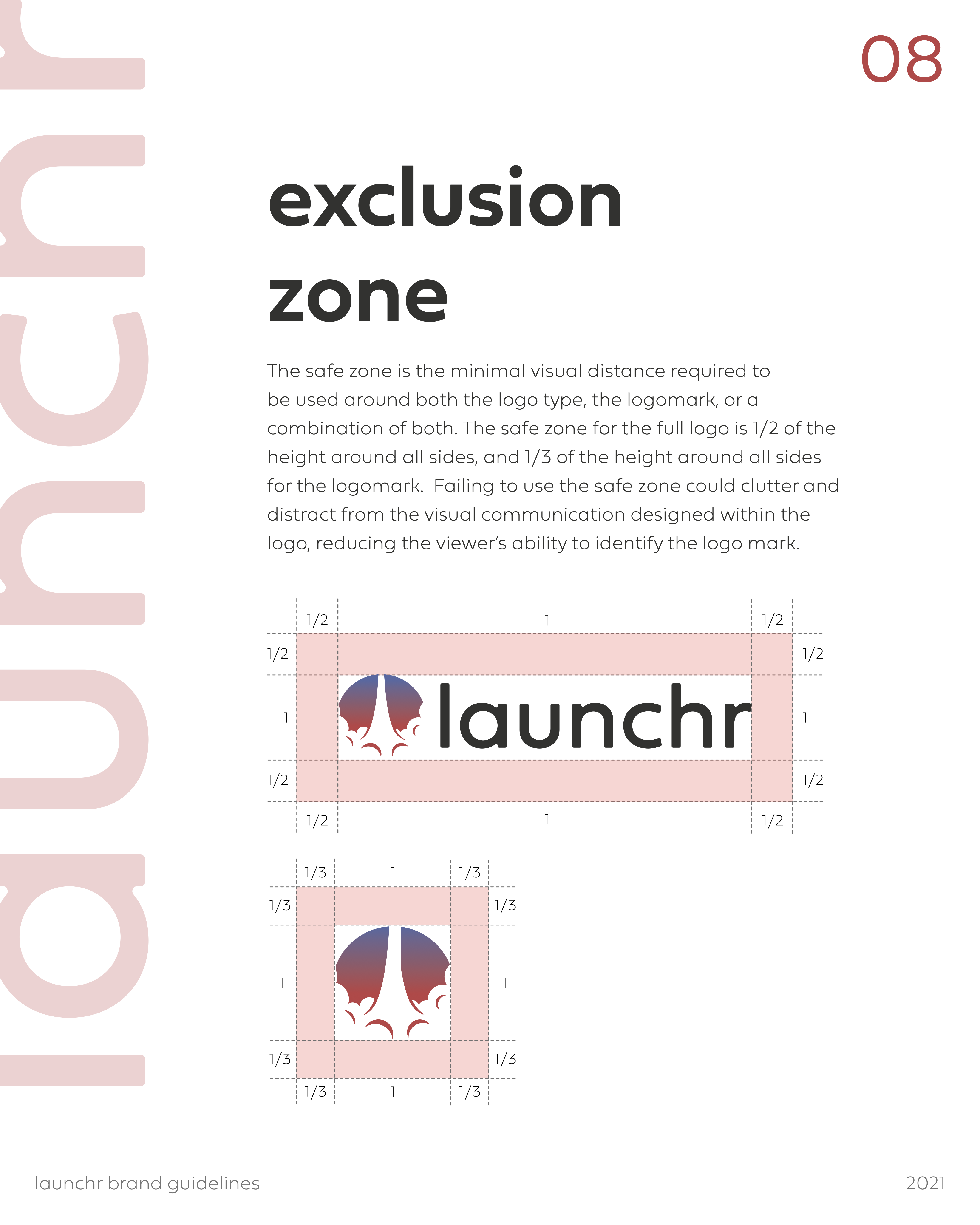
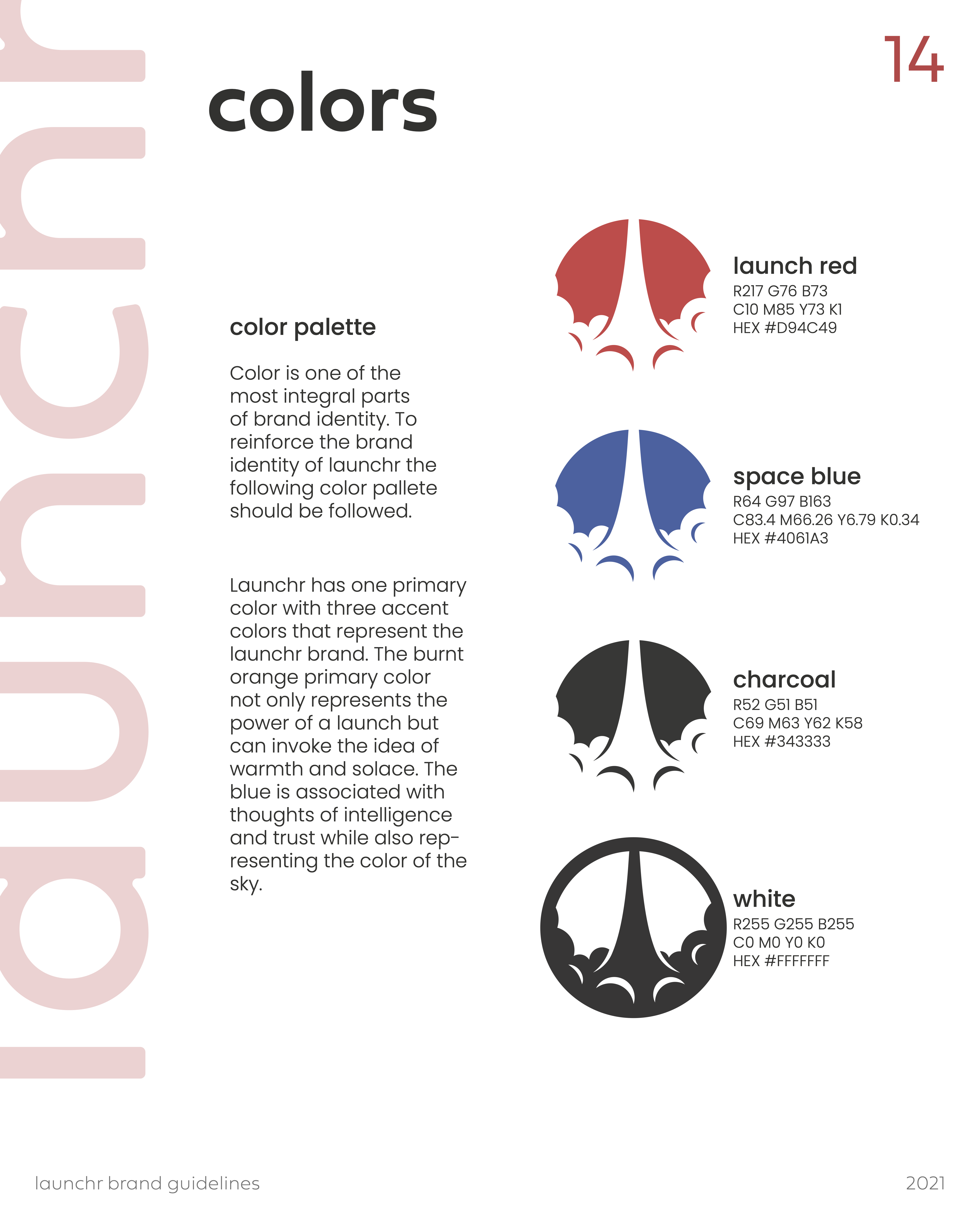
Area Two - The Brand Guide
Launchr lacked one big piece of their puzzle - brand guidelines. The old branding had one Illustrator document that served as their complete brand guide. I took the liberty of designing a new brand guide from cover to cover to ensure that there was consistency across every Launchr product.
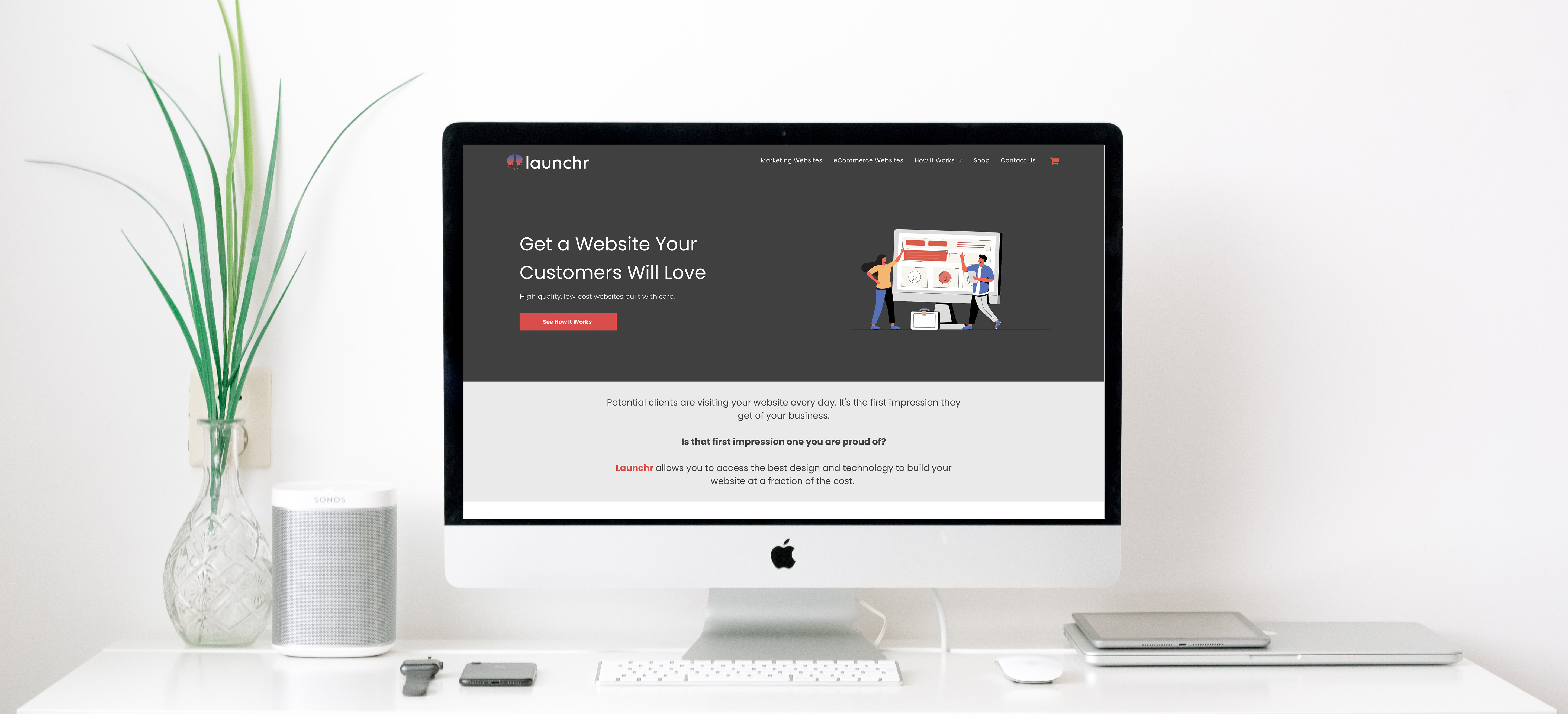
Area Three - The Website
Launchr already had a well rounded website in place, but it was all in the old branding. Using the Launchr platform, I was able to rebrand the entire website to new colors and themes. This meant no only changing some of the drag and drop content, but also diving into the HTML, CSS, and working in Illustrator to update the illustrations.